


Every now and then, a branding project ends up being a game changer for us. Via Mia became one of those. Especially in regards to brand strategy. This mainly happened due to the fact that we conducted the creative process alongside Via Mia’s own branding team, from which we learned a lot. And, of course, because of the level of complexity the project demanded.
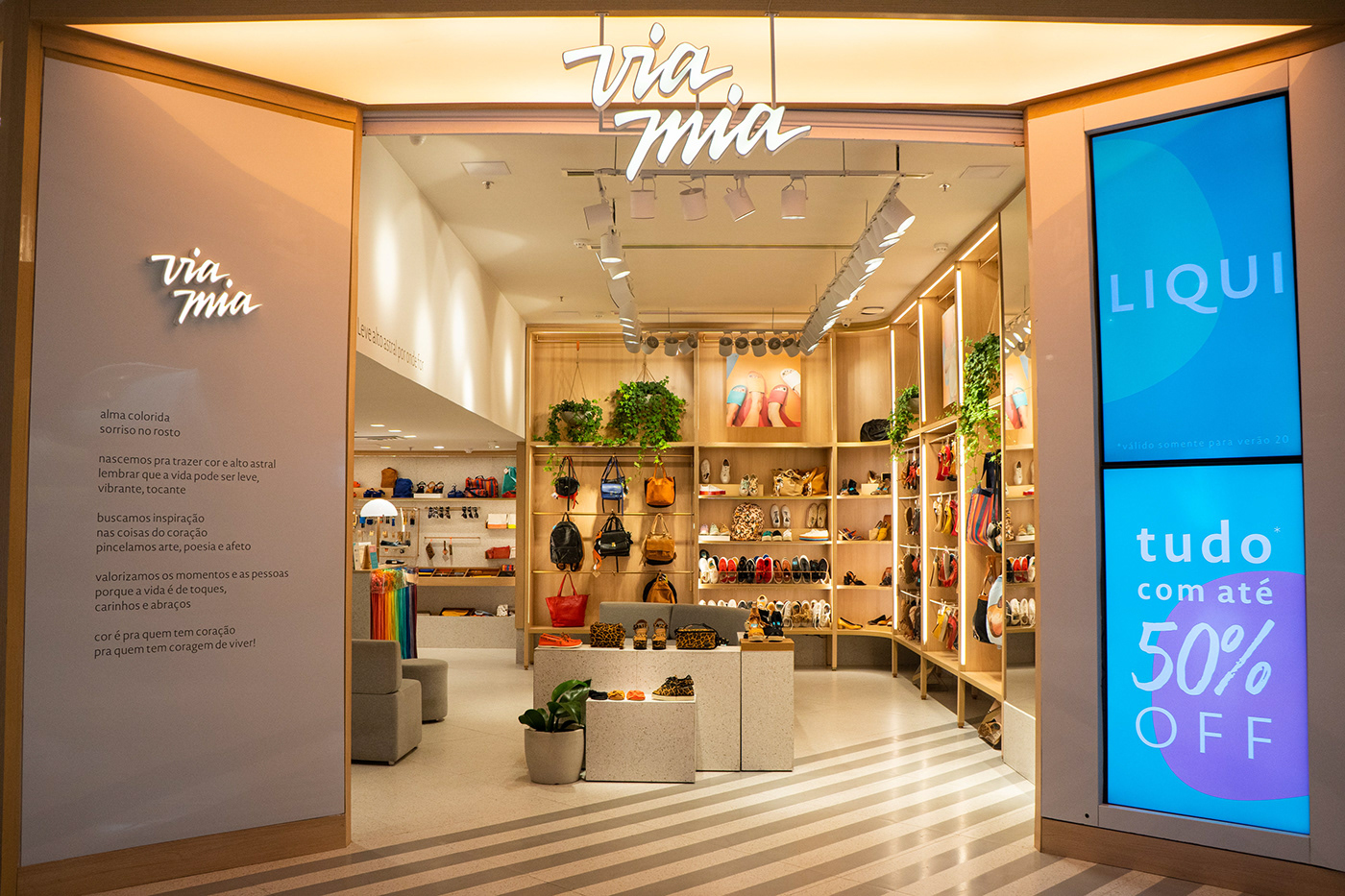
Via Mia is a fashion brand dedicated to women’s footwear and accessories. Having completed 20 years of presence in the market and opened over 100 stores all over Brazil, they decided it was time to refine the brand’s visuals and tone of voice. The thought behind it is that not only they had become more experienced as a brand after two decades, but also their audience had changed with them.
That means that the first topic of this project’s brief was to change the brand but not to transform it. Via Mia was not becoming something else. In fact, if anything, Via Mia used this moment to reinforce its essence, only more mature. Having that in mind, we knew that the solution to the project was not to look outside Via Mia, but diving deep in its own principles.
For this, we used all kinds of moodboards. The point was to imagine a Via Mia world would look like. Not only what fashion would look like in this world, of course, but what kind of music would be played in it, what kind of books would be read, what colors would the walls be and it goes on.
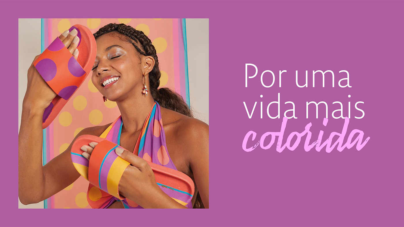
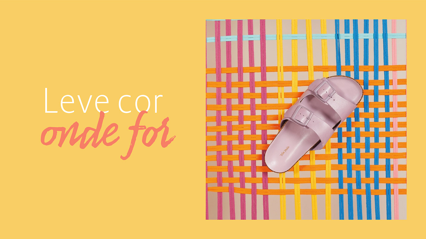
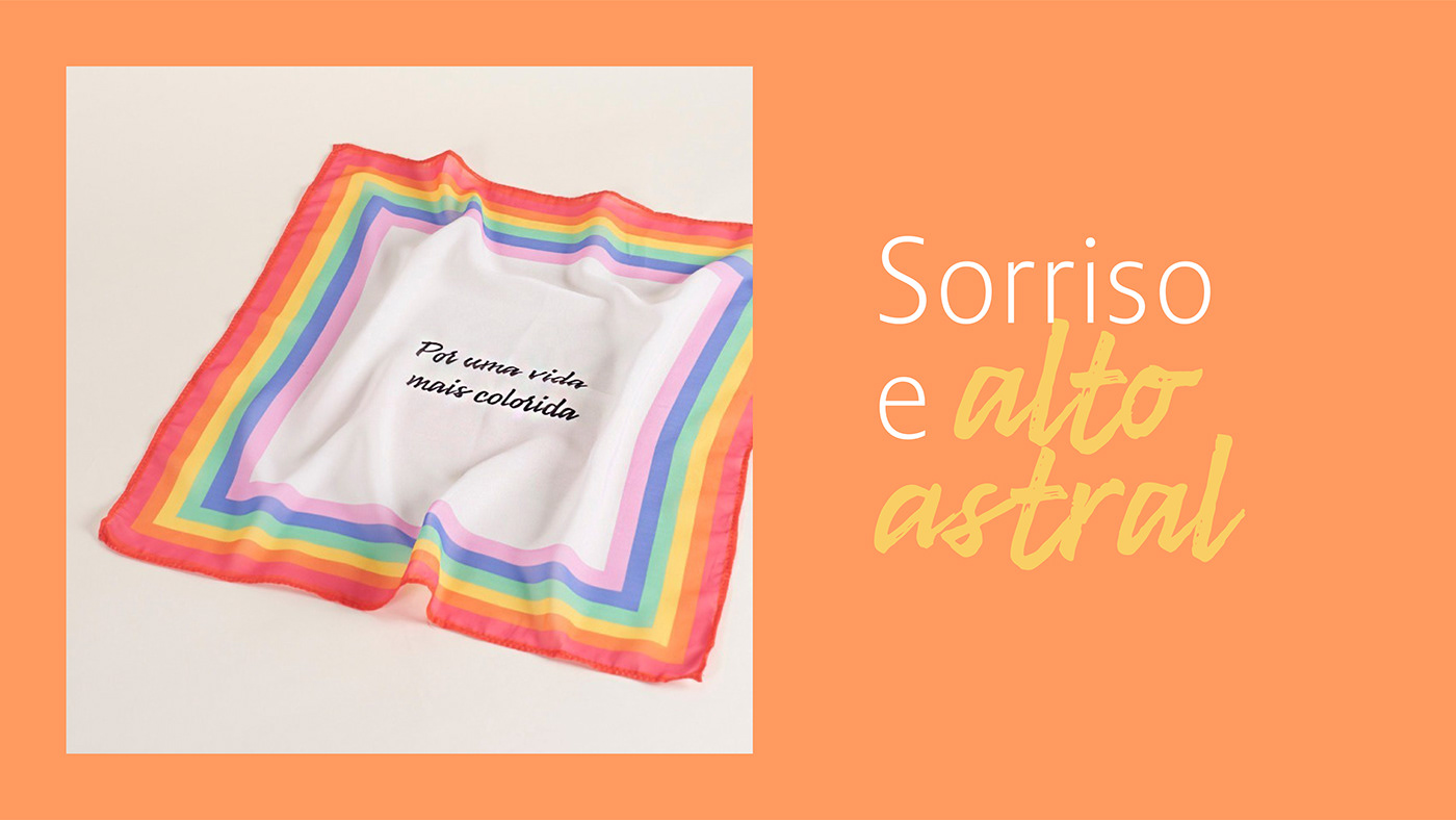
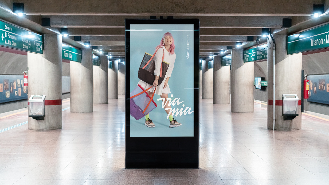
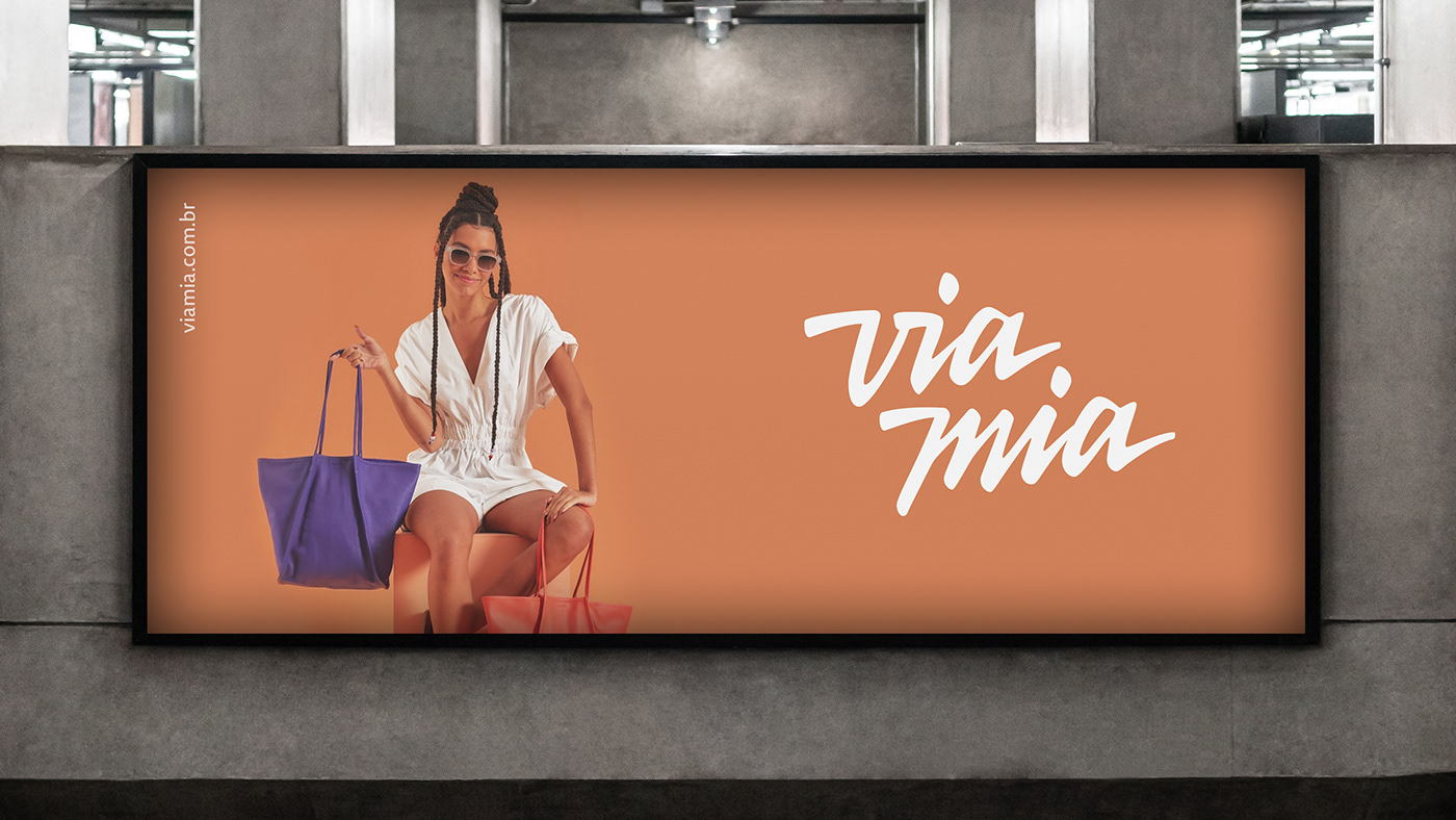
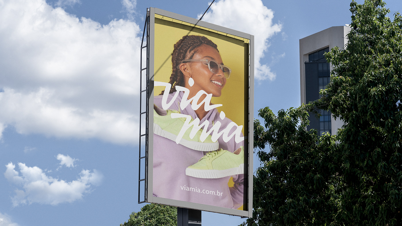
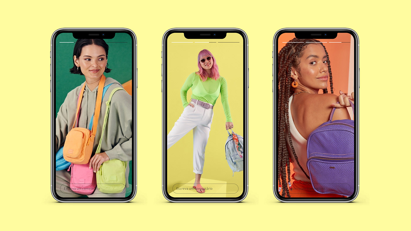
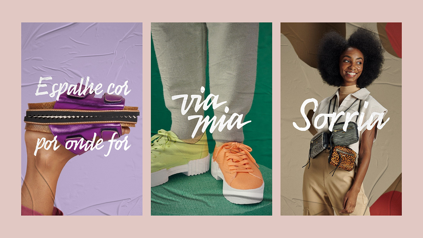
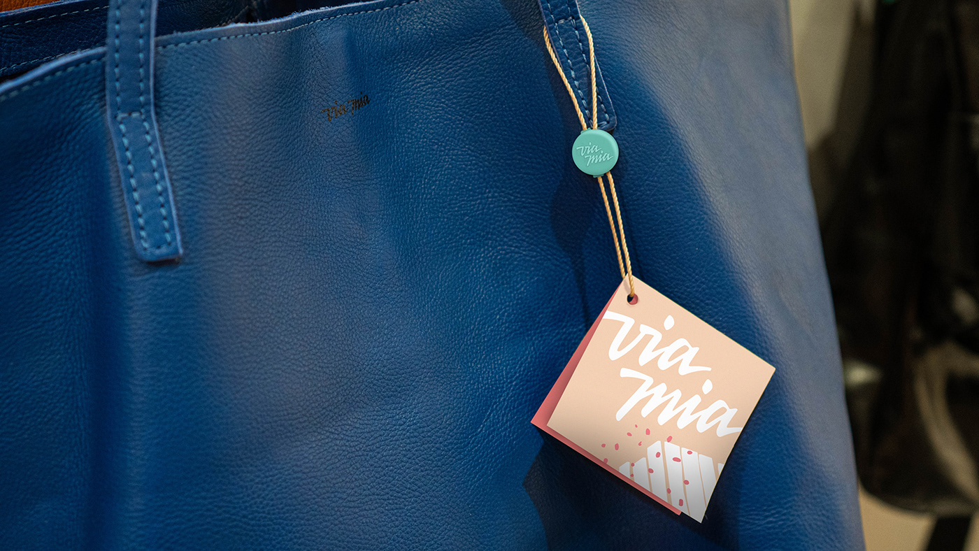
All this research was well summarized in the tagline “Espalhe cor por onde for”. Roughly translating, “Radiate color everywhere you go” (keep in mind that it rhymes in Portuguese, so it’s a lot cooler!).

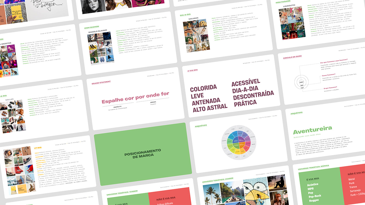
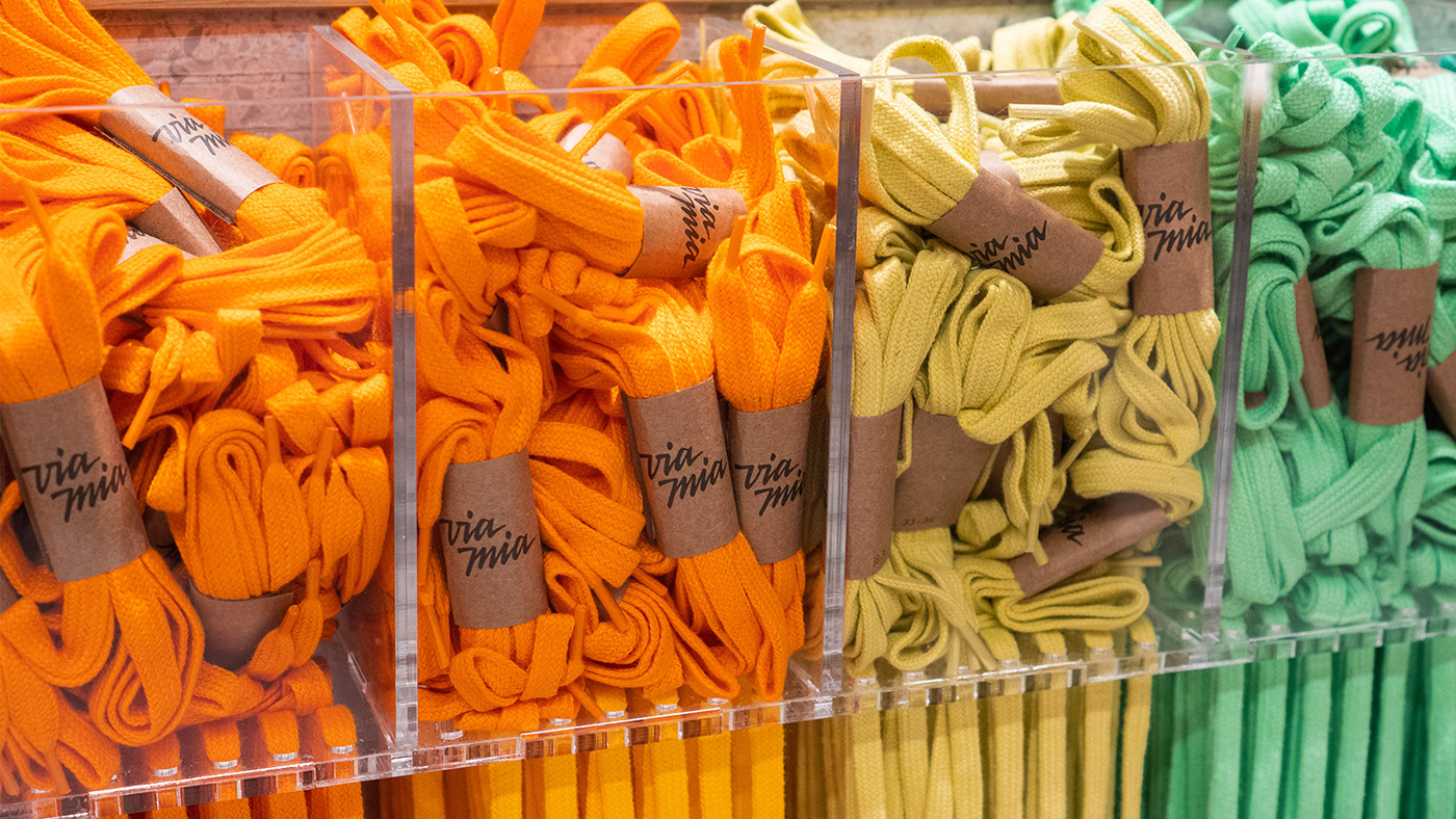
Since colors are a huge deal to Via Mia, we had to really think through before we put our feet down on the brand’s colors. In fact, we had to come up with a solution to define a range of colors for them, not only three or four tones. And those colors within this range would go everywhere, including products, so it was a big responsibility.
The solution we found for this was to decide on a range of saturation levels. We first decided on a fixed brightness level and then chose the range from 40% to 60% saturation as the brand’s working space in regards to color. This means that every possible hue within this parameters are a part of Via Mia’s identity.
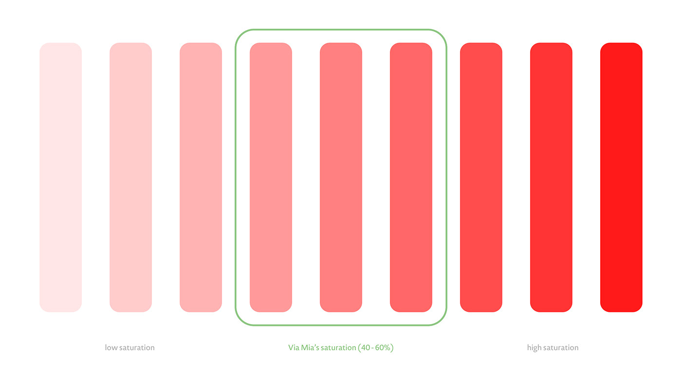

This solution gives the brand the look they were looking for but also extreme flexibility to decide on specific hues for different products, collections and campaigns. It’s like they now have a colors toolbox with dozens to colors to pick according to need.

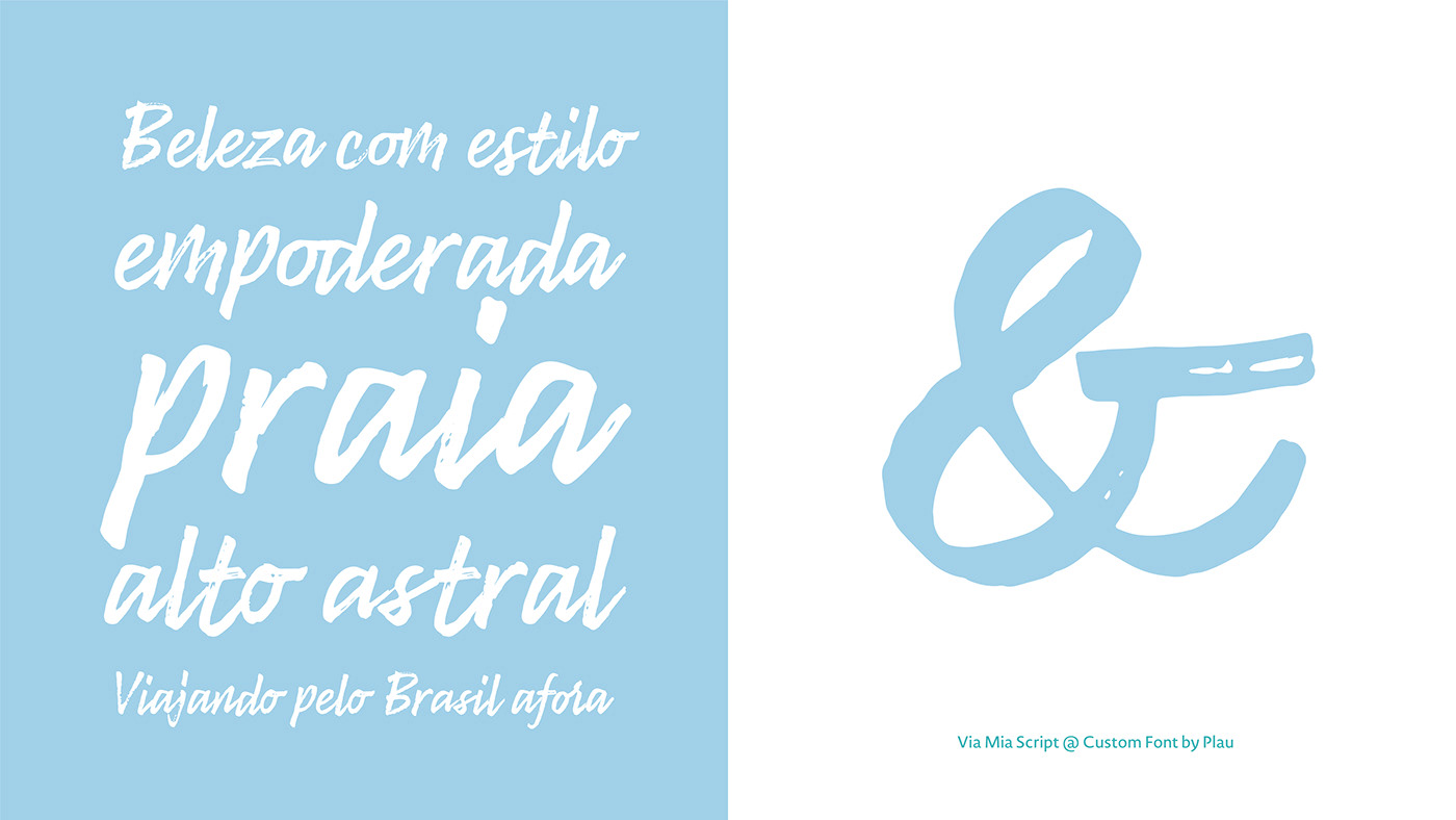
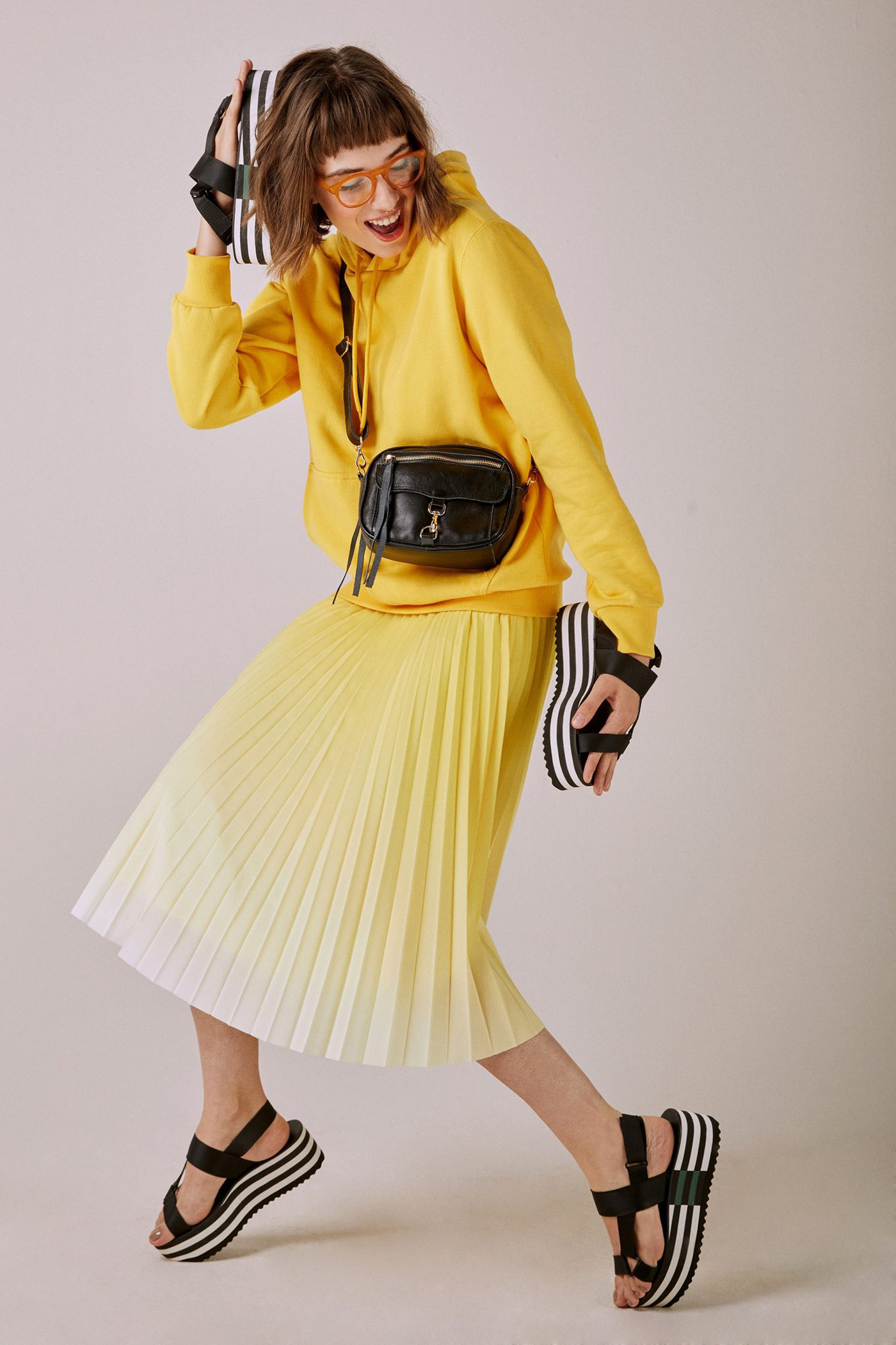
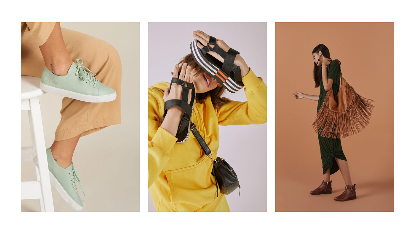
Expressiveness has always been Via Mia’s language. The brand does not shy away from its personality and every asset is full of life, from the colour palette to fonts.
The logo and brand’s typeface should represent should embrace the changes Via Mia’s audience went through alongside the brand within its two decades of existence: going from cute (maybe even a bit naive) to mature, assertive and self-aware.
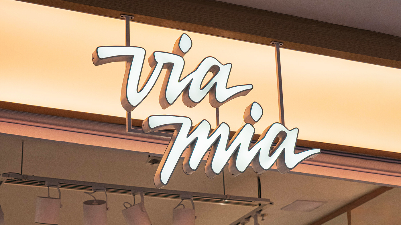
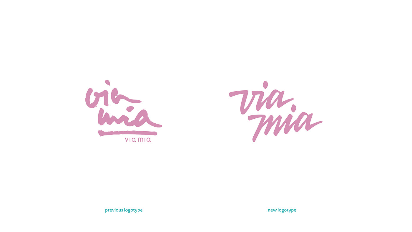
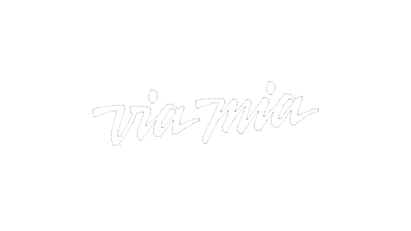
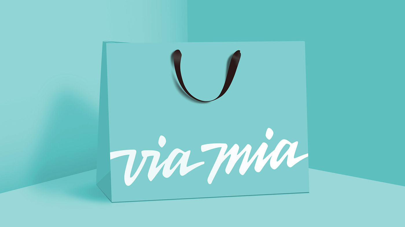
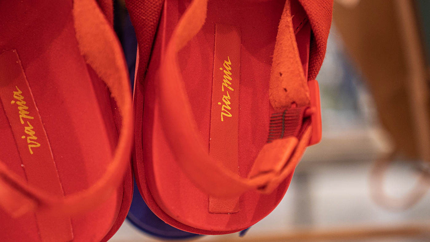
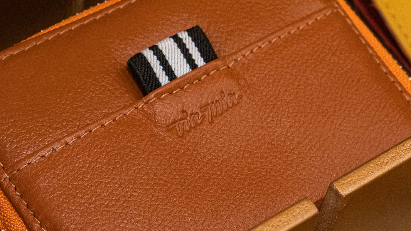
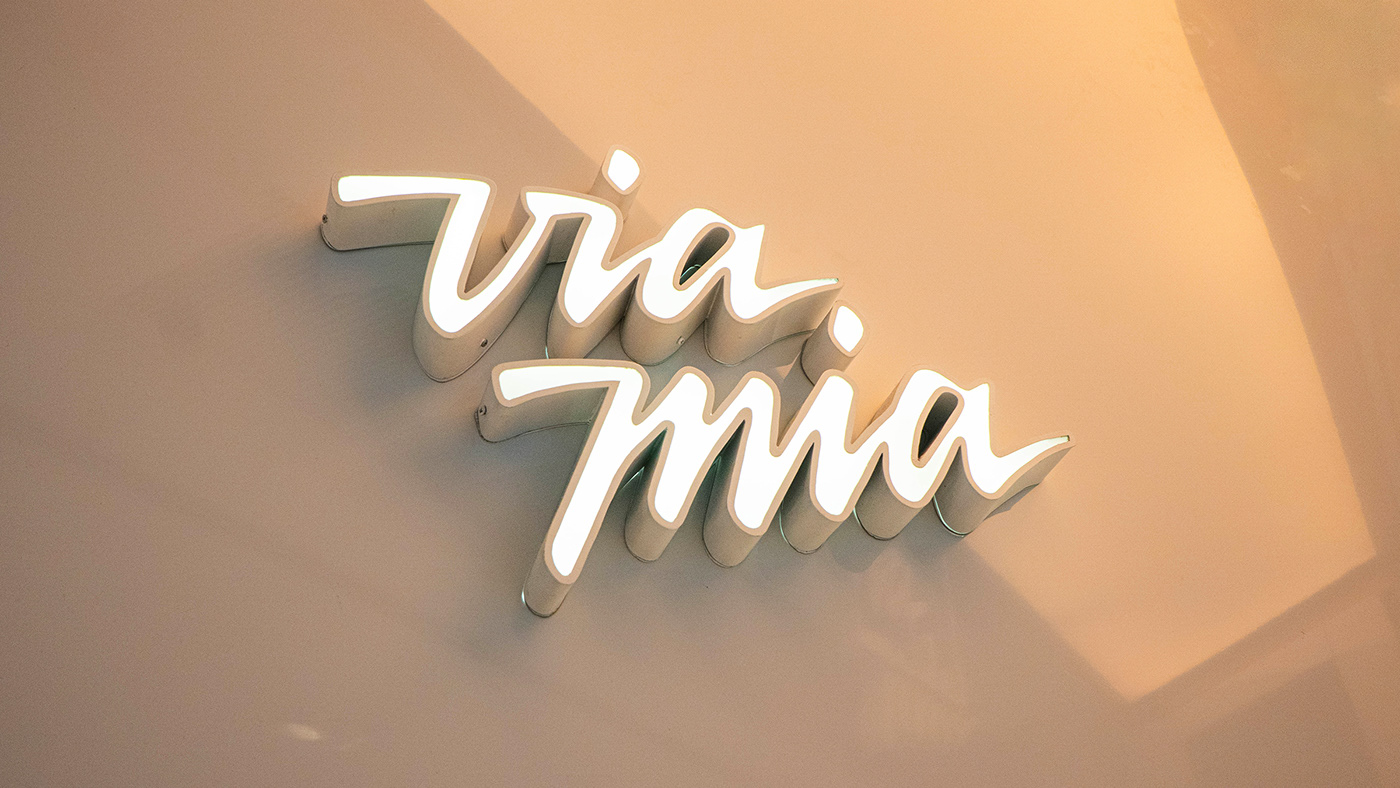
Their logo was already super expressive, but it took a radical shift on the rebrand.

From the early sketches we used the theme of the script but right out of the bat made it more legible. And we still had a technical issue to address: it was crucial that the vectors had as few points as possible so it was easier for it to be printed in metal.
The end result is almost like a sequel to the first logo. Even though they are completely different, the new logo is so instantly familiar to the brand that when one looks at it it’s hard to believe that this was not always Via Mia’s logo.
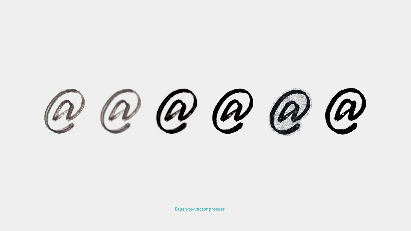
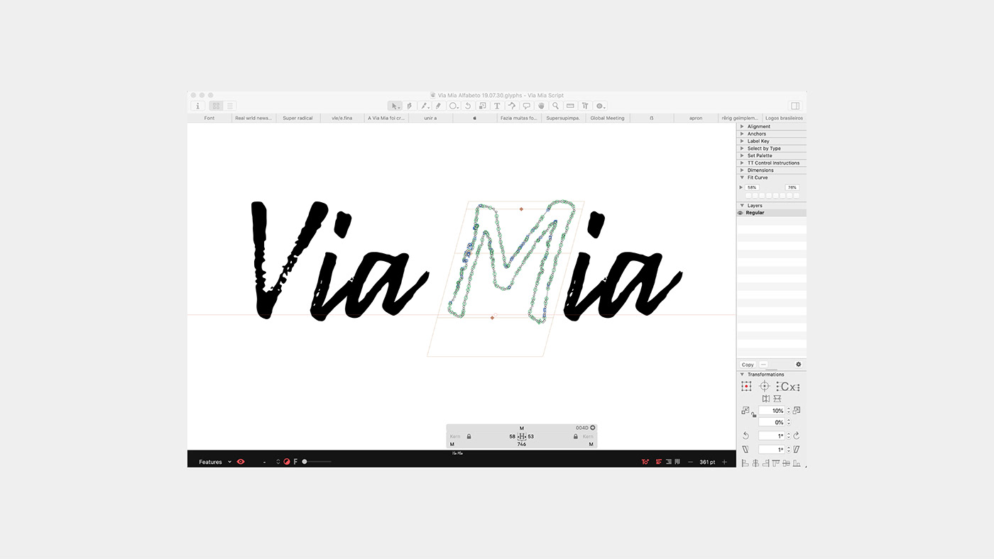
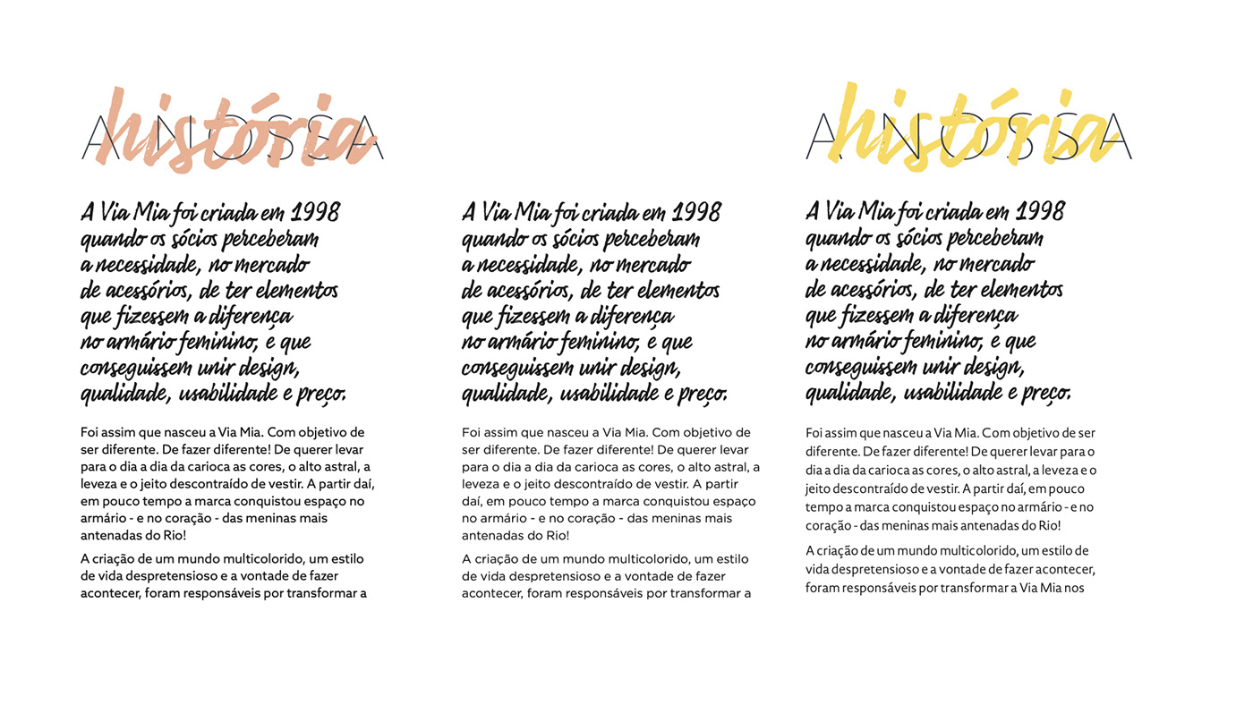
To go with the logo, we had the chance to develop a custom type. Via Mia’s stores had the tradition to display signs made by hand lettering, so we took that and created a font entirely based on handmade sketches. We actually took the scans and kept all kinds of texture that the letters had on paper. With that, Via Mia can keep the handmade feel but not depend hand lettering skills of their employees.
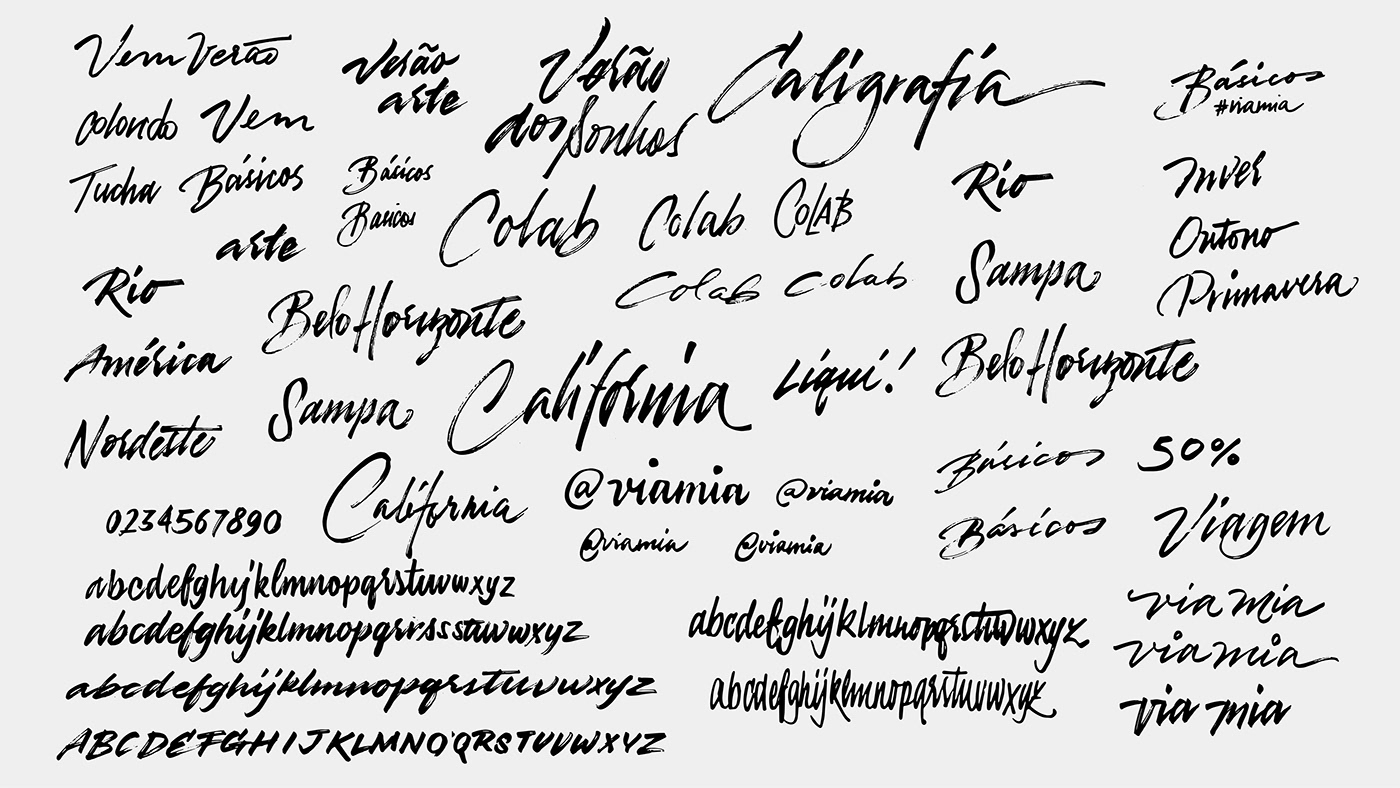
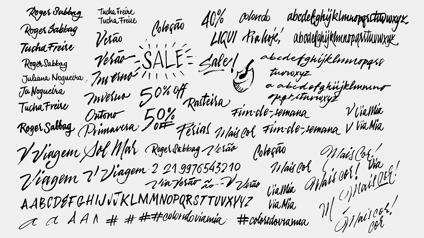
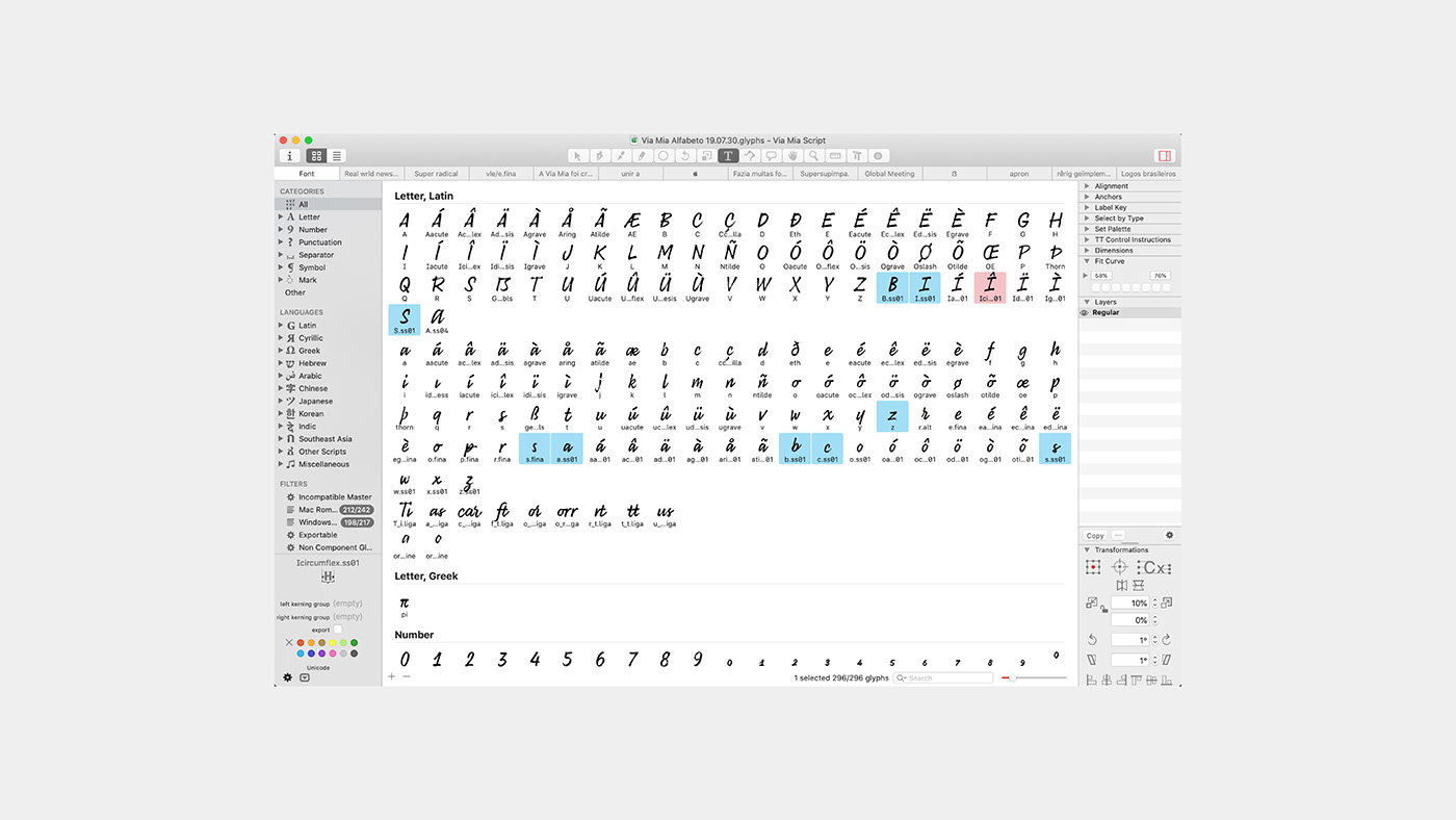
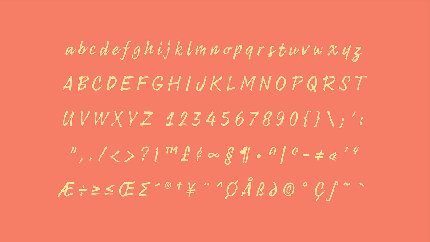
Above, the character set of the custom font. Below, the exercises for type palette.


Project Credits
Plau's Creative Director: Rodrigo Saiani
ViaMia's Creative Directors: Tucha Freire and Juliana Nogueira
Strategy: Ana Laura Ferraz, Aline Caruso, Carlos Mignot and Rodrigo Saiani
ViaMia's Creative Directors: Tucha Freire and Juliana Nogueira
Strategy: Ana Laura Ferraz, Aline Caruso, Carlos Mignot and Rodrigo Saiani
Design: Ana Laura Ferraz, Aline Caruso, Carlos Mignot, Gabriel Mesoma, Rodrigo Saiani, Gabriela Fiks, Valter Vinícius Costa,
Ana Luiza Pirá, Antonia Nobrega, Juliana Nogueira, Pedro Prieto and Heloisa Henriques
Ana Luiza Pirá, Antonia Nobrega, Juliana Nogueira, Pedro Prieto and Heloisa Henriques
Type Design: Carlos Mignot and Rodrigo Saiani
Photography: Antonia Nobrega
Store photos: Diogo Seibert
Store photos: Diogo Seibert


